Most clients these days want a mobile version of their website—at least if they’re smart they do. Here are a few key statistics:
- 91% of all people on earth have a mobile phone
- 56% of people own a smart phone
- 50% of mobile phone users, use mobile as their primary Internet source
- 80% of time on mobile is spent inside apps
- 72% of tablet owners purchase online from their tablets each week
So this means there is no shortage of users on mobile devices of varying screen sizes and resolutions designers need to deal with. To complicate matters further, in the next five years we’ll likely need to design for a number of additional inventions. In the field of Web design and development, we’re quickly getting to the point of being unable to keep up with the endless new resolutions and devices. For many websites, creating a website version for each resolution and new device would be next to impossible, or at the very least impractical. So what do we do, give up? No, we innovate—enter responsive design.
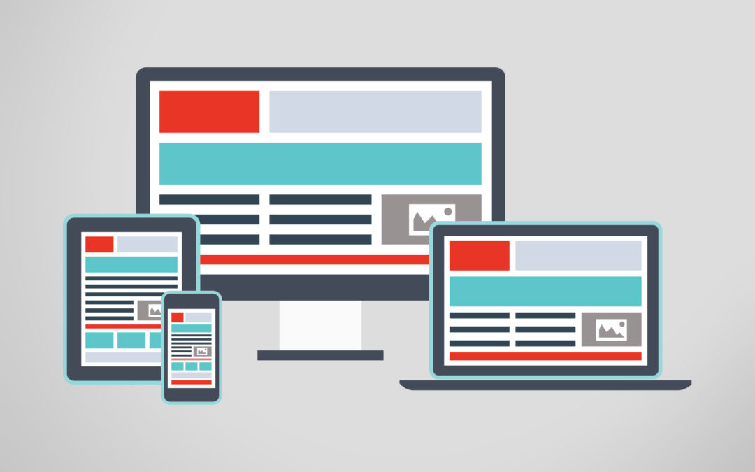
Responsive Web design is a design approach that suggests design and development should respond to the user’s behavior and environment based on screen size, platform and orientation—providing an optimal viewing experience across a wide range of devices. Responsive websites respond to their environment. Responsive sites use multiple fluid grid layouts as opposed to adaptive sites which use multiple fixed width layouts. This gives us one site for every screen. So about now you may be thinking, “Joe, this sounds expensive.” Expensive? No. But it will cost a little more—I won’t lie. The added cost is due to the additional time needed for creation of the multiple grid layouts and testing needed to be sure that the design works on a wide-variety of screens. This all amounts to a little extra expense…you’re not looking at busting budgets. The Responsive Design techniques discussed above are not the final answer to the ever-changing mobile world. It is simply a tactic that when implemented correctly can improve the user experience. It will not completely solve it for every user, device and platform but it gives us the most practical solution to serve most users. We will need to constantly work with new devices, resolutions and technologies to continually improve the user experience as things evolve in the coming years.